Image Guidelines
Link to this section
Making Images Accessible
Alternative text or "alt text" is required to make images accessible to people using screen readers.
When uploading an image to the media library, fill out the alternative text with a brief and accurate description of the image. Alternative text is used by screen readers or people whose images load slowly.
Good alternative text is descriptive but brief.
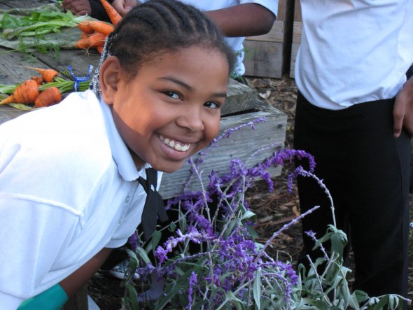
Good: "Elementary school student holds a flower pot with plants"
Not recommended: "Boy"
Not recommended: "Elementary school student with black hair in a hoodie holds a flower pot with the rim painted blue with several other students in the background"
Images with Text
Don't use images with text embedded in them. Screen readers cannot read the text in an image, and Google Translate cannot translate the text.
Image Names
Providing meaningful image names makes it easier to search for images in the media library.
When uploading an image to the media library, change the name to something meaningful. The name is what appears when people search the media library by keyword. Common keywords might include:
- Type of image
- Drawing (something that looks hand drawn)
- Graphic (a digitally created illustration larger than an icon)
- Hero (very wide banner images used in postcard carousels)
- Icon
- Logo
- Descriptions of people
- Elementary school student
- Employee
- Teacher
- Keywords
- STEM
- Laptops
- Books
- Graduation
Image Permissions
Make sure you have the permission to use any images you post.
-
Any identifiable images of students or of student schoolwork can only be used if the student or their family has signed a media opt-in form.
-
Do not use images downloaded from the internet unless they have a Creative Commons license or you have paid for the license.
-
Make sure you give attribution if the license requires you to.
-
- You can use SFUSD stock images, as they have already been permissioned.
Image Sizes
Drupal will crop images for you.
Because people now browse the internet on devices with many different screen sizes, from mobile phones to desktop computers, Drupal will crop and resize images for you to accommodate specific screen sizes.
Upload a full image instead of cropping it on your computer, and Drupal will create multiple images with different file sizes and image dimensions automatically.
Image files
- Use jpg for photos
- Use png for graphics or icons with transparent backgrounds
- Use gif for animated images (be mindful of accessibility when using animation)
Image dimensions
These are created automatically by Drupal.
Section cards
- Landscape (4:3)
- Portrait (3:4)
- Square (1:1)
Postcard carousels with backgrounds
- 768x576 (4:3)
- 1080x540 (2:1)
- 1440x480 (3:1)
- 1920x480 (4:1)
Cropping Images
Drupal will automatically crop images to fit different screen sizes. You should crop images only if there is content that you do not want to be shown on the website.

Cropping using Mac Preview:
1. Open the file you want to crop in Preview.
2. Click the Show Markup Toolbar button.
3. Click, hold, and drag on the file to create a selection.
4. Click, hold, and drag on any of the blue dots to resize the selection if needed.
5. Use the Command - K keyboard shortcut to crop the image.
Cropping using Windows Paint:
1. Open the image in Microsoft Paint.
2. Click on the Select tool in the toolbar at the top of the program window.
3. Select the portion of the image you want to crop using the Select tool.
4. Once selected, click Edit and then Copy.
5. Click File and click New.
6. In the new image, click Edit and click Paste.
Image Components Available
Components are the building blocks of your webpage. On most page templates, 2 types of Image Components can be used.
See below for examples of the following:
- Postcard Carousel Component
- Section Cards Component

Postcard Carousel Component
Sample: Postcard 1
Multiple postcards can be added using this component. A user clicks on the left and right arrows to see the next postcard.
Component Options:
Title, Media Type (Video or Image), Links (Internal or External), Link Text, Header Position (Left or Right).

Postcard Carousel Component
Sample: Postcard 2
Multiple postcards can be added using this component. A user clicks on the left and right arrows to see the next postcard.
Component Options:
Title, Media Type (Video or Image), Links (Internal or External), Link Text, Header Position (Left or Right).
Section Cards Component Link to this section
This page was last updated on May 31, 2023


